|
|
Post by Jellybean on Jan 10, 2009 7:03:24 GMT -5
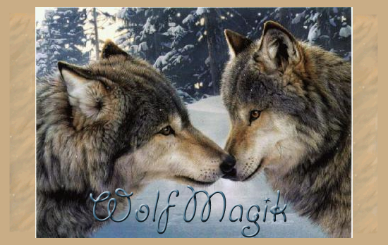
Well, I've just been changing the font on the logo picture (the picture located at the top of the page) and I have 4 different fonts that I may use. - Option 1: The Original

This is the original. The reason I don't want to use this is because the font looks so flat.
- Option 2

You can see that this is the same colour text as the original, although it is no longer flat.
- Option 3
Ignore this option - it is no longer an option.
- Option 4

This is just a different brown and pattern on the text. It blends better than Option 3, I think.
- None of them: Use a different picture
If you choose this option - Should I use a different picture than that one? If you have a picture you think suits, post here and I'll have a look ;D
- None of them: Use different font
If you choose this option - Should I use a different font than that one? What should I change about it, then? The font, colour, etc.
- Other
Have a different idea?
Post here with any of your ideas or comments. ~Administrator of Wolf Magik,  |
|